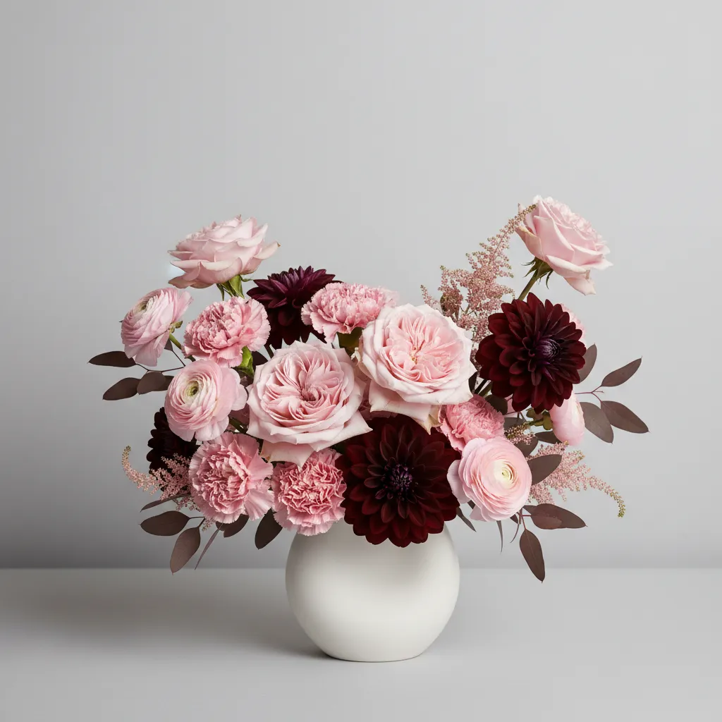
Color is the first thing people notice in a floral arrangement. Before the texture of the petals, before the fragrance, before the shape — it is color that draws the eye and creates an emotional response. But not every combination of colorful flowers produces a beautiful result. What separates a stunning bouquet from a visually chaotic one is color harmony.
Whether you are a professional florist, a floral design student, or someone who simply loves creating arrangements at home, understanding color harmony is one of the most powerful skills you can develop. This guide explains what color harmony means in floral design, how to apply it using the color wheel, and which color schemes work best for different occasions and styles.
What Is Color Harmony?
In floral design, color harmony refers to the pleasing, balanced arrangement of colors that creates a sense of visual order and aesthetic appeal. When colors in a floral arrangement work well together, the eye moves naturally across the design, the composition feels intentional, and the overall effect is satisfying rather than overwhelming.
Color harmony is not about using your favorite colors or simply picking flowers that look pretty on their own. It is about understanding how colors relate to each other and using those relationships deliberately to achieve a specific mood, message, or visual impact.
The foundation of color harmony in floral design is the color wheel — a circular diagram that organizes colors by their relationships to one another. By understanding where colors sit on the wheel and how they interact, florists can build arrangements that feel cohesive, dynamic, or dramatic depending on the desired effect.
The Color Wheel and Its Role in Floral Design
The color wheel used in floral design is based on the traditional RYB (Red-Yellow-Blue) model, which divides color into three categories:
Primary Colors are red, yellow, and blue. These are the foundation colors from which all other colors are mixed. In floristry, primary-colored flowers include red roses, yellow sunflowers, and blue delphiniums.
Secondary Colors are orange, green, and violet. These are created by mixing two primary colors. Orange lilies, green chrysanthemums, and purple lavender are common examples in floral design.
Tertiary Colors are the colors produced by mixing a primary and a secondary color, such as red-orange, yellow-green, or blue-violet. These in-between shades give florists a much wider palette to work with and allow for subtle, sophisticated transitions between colors.
Beyond hue, florists also work with three additional color properties that affect harmony:
Value refers to how light or dark a color is. Adding white flowers raises the value (tints), while adding darker blooms lowers it (shades). Managing value prevents arrangements from feeling muddy or flat.
Saturation refers to the intensity or vividness of a color. Highly saturated flowers are bold and vibrant, while desaturated or muted tones feel softer and more romantic.
Temperature refers to whether a color feels warm (reds, oranges, yellows) or cool (blues, purples, greens). Warm colors advance visually and feel energetic; cool colors recede and feel calm.
The Main Color Harmony Schemes in Floral Design
Professional florists rely on several well-established color harmony schemes, each producing a distinct visual effect.
1. Monochromatic Color Harmony
A monochromatic arrangement uses a single hue in varying tints, shades, and saturations. For example, a bouquet built entirely from pale blush roses, medium pink peonies, and deep burgundy dahlias is a monochromatic design — all variations of red or pink on the color wheel.
Monochromatic schemes are elegant, sophisticated, and easy to achieve. They are popular for weddings, corporate events, and minimalist design styles. The key to making them work is ensuring enough variation in value and texture so the arrangement does not feel flat or one-dimensional.
2. Analogous Color Harmony
Analogous color harmony uses colors that sit next to each other on the color wheel, typically three to five adjacent hues. A classic example would be an arrangement combining yellow, yellow-orange, orange, and red-orange flowers — think sunflowers, marigolds, orange dahlias, and red gerbera daisies.
Analogous schemes feel natural, warm, and cohesive because the colors share underlying pigment relationships. They are found frequently in nature — a sunset, autumn foliage, a tropical garden — which is why they feel so visually comfortable. Analogous arrangements work beautifully for garden-style designs, fall arrangements, and relaxed, organic aesthetics.
3. Complementary Color Harmony
Complementary colors sit directly opposite each other on the color wheel. Common complementary pairs include red and green, purple and yellow, and blue and orange.
Complementary schemes create the highest level of contrast and visual energy of any harmony type. When placed next to each other, complementary colors make each other appear more vibrant and intense — a principle called simultaneous contrast. A bouquet of deep purple lisianthus paired with bright yellow billy balls is a striking example of complementary harmony in action.
These arrangements are bold, attention-grabbing, and ideal for celebrations, statement pieces, and designs that need to stand out from across a room.
4. Split-Complementary Color Harmony
A split-complementary scheme takes one base color and pairs it with the two colors on either side of its complement rather than the complement itself. For example, instead of pairing blue directly with orange, you would pair blue with yellow-orange and red-orange.
This approach delivers much of the visual contrast of a complementary scheme but with slightly less tension, making it easier to balance. It is a popular choice among experienced florists who want drama without the starkness that pure complementary pairings can sometimes produce.
5. Triadic Color Harmony
A triadic scheme uses three colors evenly spaced around the color wheel, forming a triangle. The classic triadic combination is red, yellow, and blue — the three primary colors. Another example is orange, green, and violet.
Triadic arrangements are vibrant, playful, and full of energy. They work well for festive occasions, children’s events, and bold decorative installations. The challenge with triadic schemes is balance — one color should typically dominate while the other two serve as accents to avoid visual chaos.
6. Tetradic (Rectangle) Color Harmony
Tetradic schemes use four colors arranged in two complementary pairs, forming a rectangle on the color wheel. For example, red, orange, blue, and green used together create a tetradic palette.
This is the most complex harmony scheme and the hardest to execute well. However, when managed carefully — with one dominant color and the others used sparingly — tetradic arrangements can be extraordinarily rich and luxurious. They are best suited to large-scale installations, elaborate centerpieces, or designs where visual abundance is the goal.
The Role of Neutrals in Color Harmony
No discussion of color harmony in floral design is complete without addressing neutrals. White, cream, grey, and brown tones are not technically colors on the wheel, but they play a vital role in almost every professional arrangement.
Neutrals act as visual breathing room. They prevent arrangements from feeling overwhelming, help separate competing colors, and allow the eye to rest between bold focal flowers. White flowers like garden roses, ranunculus, or Queen Anne’s lace are among the most versatile elements a florist can use, capable of lifting any color scheme and adding elegance without disrupting harmony.
Foliage also functions as a neutral in floral design. Eucalyptus, ferns, and dusty miller introduce cool green tones that complement nearly every color scheme while adding texture and natural movement to arrangements.
How Mood and Occasion Influence Color Harmony Choices
Color harmony in floral design is never chosen in a vacuum. The intended mood, occasion, and setting should always guide which scheme a florist selects.
Romantic and wedding designs typically favor monochromatic schemes in soft blush, ivory, and white, or analogous palettes of peach, coral, and pink. These combinations feel tender, timeless, and intimate.
Celebratory and festive designs benefit from triadic or complementary schemes that feel energetic and joyful. Bright complementary pairings of yellow and purple, or red and green, signal excitement and abundance.
Sympathy and memorial arrangements traditionally use cool, muted analogous schemes — soft blues, lavenders, and whites — that convey calm, peace, and reverence.
Seasonal designs naturally align with the analogous palettes found in nature: warm oranges and reds for autumn, cool blues and whites for winter, soft yellows and greens for spring, and vibrant jewel tones for summer.
Practical Tips for Achieving Color Harmony in Floral Design
Developing a strong eye for color harmony takes practice, but these principles will accelerate your progress significantly.
Always start with your focal flowers first, then build your color scheme around them. Trying to add a dominant focal flower after selecting supporting blooms almost always leads to imbalance.
Work with an odd number of color groupings. Odd numbers — three, five, seven — feel more dynamic and natural than even groupings, which can make arrangements feel stiff and symmetrical.
Consider the background and setting where the arrangement will be displayed. A bold complementary scheme that looks spectacular against a white wall may feel overwhelming in a room with busy patterned wallpaper.
Do not overlook the contribution of stems, seed pods, berries, and textural elements. These elements carry color too and can either reinforce or disrupt your intended harmony.
Test your color combinations in natural light before committing. Artificial lighting significantly changes how colors appear, particularly with purple and blue flowers, which can shift dramatically under warm indoor light.
Frequently Asked Questions
Why is color harmony important in floral design? Color harmony ensures that the colors in a floral arrangement work together to create a pleasing, balanced visual effect rather than competing with or clashing against each other. It is what separates a professional-looking arrangement from one that feels random or chaotic.
What is the most popular color harmony scheme in floristry? Analogous and monochromatic schemes are the most widely used in professional floristry, particularly for weddings and events, because they are elegant, cohesive, and relatively forgiving to execute.
Can you mix warm and cool colors in a floral arrangement? Yes, but it requires careful balancing. Mixing warm and cool colors creates contrast and visual interest, but one temperature should generally dominate to maintain harmony. A predominantly warm arrangement with a few cool accents is easier to manage than a 50/50 split.
What colors clash in floral design? Colors that are near-complementary but not quite opposite on the wheel — such as red-orange paired with purple — can clash because they have neither the clear contrast of true complementary colors nor the closeness of analogous ones. Similarly, colors of nearly identical value but different hues can feel muddy when placed together.
How do florists use the color wheel? Florists use the color wheel as a visual reference tool to identify which colors relate harmoniously to each other — whether through proximity (analogous), opposition (complementary), or equal spacing (triadic). It removes the guesswork from color selection and provides a reliable framework for making intentional design decisions.
Conclusion
Color harmony in floral design is both a science and an art. It is grounded in the structured relationships of the color wheel, but it comes to life through the florist’s intuition, experience, and sensitivity to mood, occasion, and setting. Whether you are designing a simple hand-tied bouquet or a grand event installation, understanding how colors relate to and enhance each other will elevate every arrangement you create.
Mastering color harmony does not happen overnight, but every arrangement you build with intention moves you closer to the kind of instinctive color confidence that defines truly exceptional floral design.


